Showing posts with label graphic design. Show all posts

Friday, October 28, 2011

Some Beautiful Type Images from Ffffound.com

Good Morning! Thought I'd share some inspirational photos I collected from ffffound.com! :) Happy Early Halloween!


Thursday, September 8, 2011

NJ Transit's Departure from the 20th Century

So... NJ Transit got a much needed facelift. At least for their bus schedules...

New and Old NJ Transit Bus Schedule
The blue is very nice touch and the pictogram cover separates it nicely from all the other dated bus schedule pamphlets in Port Authority.

The inside has also been reorganized and looks much easier to read.

I apologize for the low quality photos... it was a quick picture from my iPhone. I just got back from London yesterday as well. I'm going to have some gorgeous photos to show soon so hang on till then :).

Thursday, October 21, 2010

Beautiful IBM Graphics

So, another thing I noticed at the jetBlue terminal were these beautiful IBM Smarter Planet ads. Take a look:


The graphics are so beautiful yet fun.
(Last two pictures: source)

These are screenshots taken from the IBM Smarter Planet website. The graphics look great as icons as well!

As for the individual pages, I love how the photographs were integrated into the shapes. It could've easily looked overdone and corny, but they've changed the shapes enough so it doesn't look repetitive.


When you scroll down, information graphics take over.


This was a collaboration between Office and Oglivy & Mather. They were influenced by Paul Rand. Amazing. More about the graphics here: http://www.visitoffice.com/main.html

jetBlue Terminal

Alright, so I've taken a TON of pictures over the summer, but never posted them. Well, now I'm getting to it x). One example is are these pictures that I took from the airport, going to Puerto Rico in August.

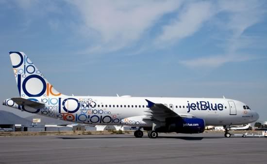
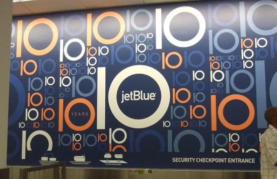
Behold, the jetBlue's 10th Year Anniversary graphics.


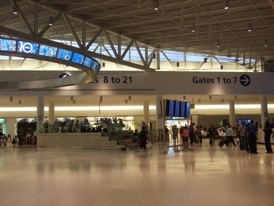
This was at checkpoint. The mural behind the counter was so striking! Very nice typography.

It's interesting how they integrated the "10" motif into their new terminal.

And this picture... I took from online, but they have a 10th year plane as well!

Ahh, how I love jetBlue (compared to Continental). Leg room, no uncomfortable chairs, water bottles, and solid yet modern design... Here are their other plane graphics: http://nycaviation.com/2010/02/11-photos-celebrating-10-years-of-jetblue/

Monday, September 20, 2010

A Suprising E-Blast

I have to say that opening my email to this, was hilarious xD.


They really know how young people think huh... (cuz I'm totally sucked in by the e-blast,... even if I don't feel like looking at UO dresses). I even feel like it works typographically, from a conceptual point of view. While it resembles internet verbage, the "S's" also indicate their large selection of dresses.

Definitely one of the better e-blasts out there.

Thursday, September 2, 2010

Poems for EVERYTHING.

So I found these books in Barnes and Nobles a while ago... but I just remembered them today. I still love them. What beautifully designed covers and hilarious titles xD.

Introducing the Random House's Everyman's Library Pocket Poets series. Here's just some samples of the covers:


Here's the side view. I love the colors and traditional decorations used. It's interesting to see which decorations they associated with which kind of book.

So the history behind them is Joseph Dent's (1849-1926) mission to allow everyone to afford the classics. Everyman's Library is one that anyone can afford while providing endless knowledge. The library's fine bookmaking is kept a commitment, according to the Random House website. You check out at ALL the gorgeous books >>>>HERE.