

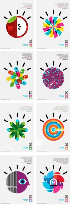
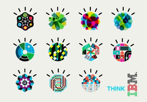
The graphics are so beautiful yet fun.
(Last two pictures: source)
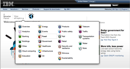
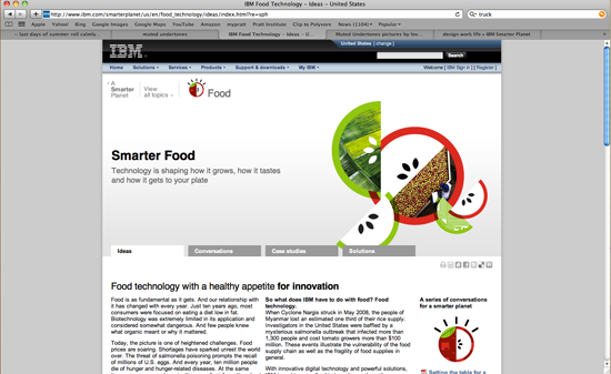
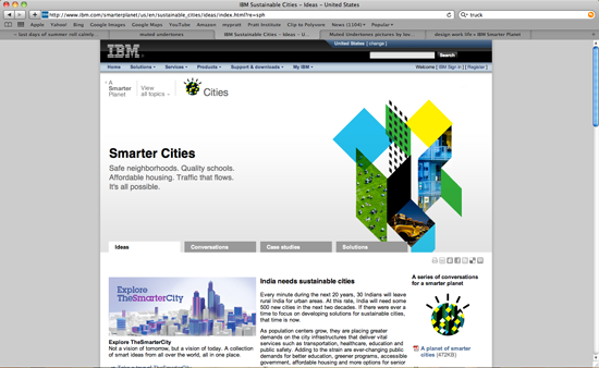
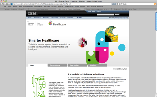
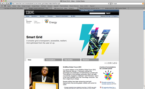
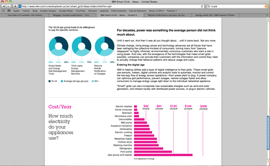
These are screenshots taken from the IBM Smarter Planet website. The graphics look great as icons as well!
As for the individual pages, I love how the photographs were integrated into the shapes. It could've easily looked overdone and corny, but they've changed the shapes enough so it doesn't look repetitive.
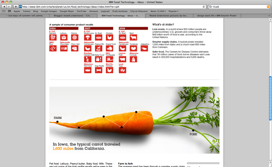
When you scroll down, information graphics take over.
This was a collaboration between Office and Oglivy & Mather. They were influenced by Paul Rand. Amazing. More about the graphics here: http://www.visitoffice.com/main.html
No comments:
Post a Comment