
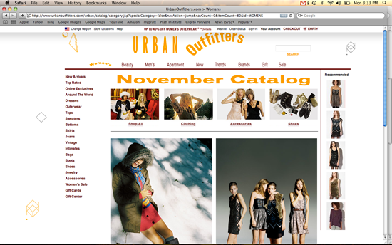
Stretched type is one of the biggest "no-no's" in graphic design. Yet there's something so funny and great about this.
Walking that fine line of horribly outdated, corny, and "geek, vintage, cool" that seems in be a trend these days.
It's funny how the section title arcs when I click on it. lol
^Taken from "Brand New."
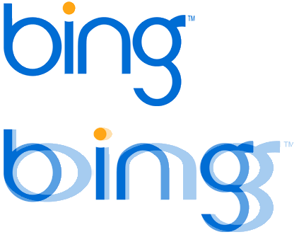
Bing's stretched logo isn't nearly as charming though, as the "Brand New" blog says HERE (*Apparently, Urban Outfitters was also seen on the "Brand New" blog: HERE)
Cheers to taking chances UO! I like it. Even if this is just a corny/trendy thing, they pulled it off and that's a hard thing to do. :)
No comments:
Post a Comment